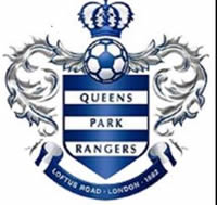
QPR Unveil Elegant New Crest Designed by Fans
Old shield and coat of arms replaced after six month consultation
This is the first reworking of the football club’s logo for eight years, and it is very different to the previous one, with no shield or mention either of Loftus Road or London.

This time round, fans have voted for a very simple, clear logo, which is particularly easy to read on mobile phones and tablets.
In the consultation, nearly two thirds of fans said they wanted to see the initials QPR back on the club crest, rather than just the name spelled out in full.
The new crest is housed within two hoops, celebrating one of the club’s nicknames.
QPR unveiled the remodelled logo ahead of its final game of the season at Loftus Road – a morale-boosting 1-0 victory over Bristol City which left the Rs comfortably in mid-table on 60 points.
QPR says the produced 17,000 responses, full of suggestions and comments. Only 12% wanted to keep the shield and coat of arms, and 74% wanted the date of formation, which is now on the crest as 1882.
This however is not without controversy, as the Queens Park Rangers name was only coined in 1886 after two youth club teams – one of them called Christchurch Rangers – joined forces.
Rival club Fulham claim a foundation date of 1979, when they were actually the snappy Fulham St Andrew’s Church Sunday School FC. However QPR emerged as a name two years ahead of Fulham FC, and nearly 20 years before the upstarts at Stamford Bridge.
May 16, 2016